Tuesday, 13 December 2011
Evaluation Question 3
Focus Groups - I held me a couple of focus groups finding out what people had liked about my products. The reason for me choosing the these people was because they are all of a similar age of what the target audience i am representing is.
Focus Group - Ages 17 to 19
Rachael Fletcher - Aged 18
Rachel Walls - Aged 18
Saturday, 10 December 2011
Final Products
Magazine Cover;
 I really like how my magazine turned out, i feel that i have challenged the typical conventions of horror, but still kept it relatively simple so the readers an easily recognise the fact that its a horror film magazine simply because of the colours, fonts and image used on it.
Film Poster;

All in all i think my trailer came out ok, if there would have been more time i feel that it could have been better. I am aware that it is in no way the same as my original storyboards, but after going through the storyboards again i didn't think it would be very 'creepy' which is what i wanted it to put across, now i feel that with the fewer clips, slow editing and piano music the 'creepy' feeling is apparent

Film Poster;

With my film poster i wasn't sure if i liked it, but after getting verbal feedback from peers and teachers i thought it suited the genre and idea of the film package very well, it isn't typical of a film poster to be so edited, but in this case i think it works and has the 'creepy' feeling i wanted it to have.
Film Trailer;
Film Trailer;
All in all i think my trailer came out ok, if there would have been more time i feel that it could have been better. I am aware that it is in no way the same as my original storyboards, but after going through the storyboards again i didn't think it would be very 'creepy' which is what i wanted it to put across, now i feel that with the fewer clips, slow editing and piano music the 'creepy' feeling is apparent
Friday, 9 December 2011
Tuesday, 18 October 2011
Model Release Forms
Forms for Actors under 16 -
Below show model release forms for the children who are featuring in my products. The parent signed an agreement which states -
Below show model release forms for the children who are featuring in my products. The parent signed an agreement which states -
'I hereby give Robbie Blaser, the irrevocable and unrestricted right to use and publish video footage or photographs of my child. These may be used for educational purposes (that may include publishing to a public video forum, such as Youtube or a blog), film production or advertising.
I am fully aware of the nature of the film and the acting requirements of my child and I am satisfied that these have been explained in detail to me by Robbie Blaser.'

Ben Crabb - 10 years old.
Daniel Crabb - 4 years old.

Actors
I used 2 actors in my film package, i am aware that both the actors are minors therefore i made sure i had there parents with me at all times while fimling and taking the pictures.
Beb Crabb - 12/08/2001

Daniel Crabb - 25/09/2007

Recce
Below show all the locations i have used during the filming/photo-shoot process -
*OTHERS TO GO IN*
*OTHERS TO GO IN*
Thursday, 13 October 2011
Constructing Poster

I started with using a plain white background in order to position the rest of the components onto it and make sure they were in an appropriate place.

I then added the masthead. I used a font called 'Darlin BTN' as it looked childish - which is what i wanted to portray in my products. Originally the 'e' of the masthead was the right way round, but after rasterizing the text i changed the direction in which it looked. I then added a red outer glow to carry on the typical conventions of a horror using the 3 colours of red, white and black.

I then added the tagline to the product, i chose to use the same font as the title because, again, it brings the childish component i was looking for, i also added an outer-glow on the tagline, but made sure it was less visible and only had a little glow to it.

I added 'coming soon' which is apparent on many different posters i have looked at, and again on this i added the outer glow the same as the masthead and tagline to carry on the continuity.


For the image above, i uploaded an image i had taken to a website called befunky.com, i reason i used the website instead of using photoshop was becuase i was unable to create this particular cartoon-ish effect on there, and the website eabled be to do it easily and wasnt time consuming.

Next i used the 'threshold' effect on photohsop, and made it like above. I played around with it until i was happy with the way it looked. Also i feel the final outcome of the image looks well and suits the genre i am representing.

Next i added a website for my film. I decided to use a simple web address 'www.benthemovie.co.uk', as these are what i seen upon researching other film posters. the font i used was called 'Times' which was downloaded from dafont.com, the reason i chose this font was because it had a traditional feel to it, which i wanted to come across in my products.

The final thing i did to my poster was added the BBFC, earlier in the research stages i thought 15 was a suitable age for horror as it was the same for both horror trailers/posters i had looked at. I downloaed the image from wikipedia commons.
Constructing Magazine Cover

This is the original image i started out with, after making the background black and feathering it i got the effect i wanted before i actually started editing the photo to how i wanted it. To start out with i had a big shadow behind it and struggled to get rid of it, but using the 'outer glow' and 'inner glow' i could make it seem feathered and make the outline a little softer.

In order to get the look i wanted, i made used many different tools, one of which was a layer mask which i used to merge 2 images together, what i mean by this is i duplicated the main image and used the threshold effect on one of them, then changed the layer style which merged them together. Then using the 'burn' tool i added the extra dark areas around the eyes, in the mouth etc to create a creepy look.

Next came the masthead, i decided to call the film 'cine de terror' as it had the niche feeling i wanted to have my magazine represent, originally i was going to call it 'scream film' but felt that the name its self was too mainstream and i wanted my product to have an original feeling to it. 'cine de terror' is horror film in Spanish, and i think that by having the masthead in another language is a good way of enticing readers in to find out what the actual magazine is about. - on the masthead i used a plain black font as i wanted a glow around it, unsure of what colour to use i was stuck between choosing red or white, as you can see i went for the white as it stand out more, and if i went with the red it wouldn't have stood out as much because the vast majority of the magazine cover has some kind of red in it. The font its self is a stereotypical 'scary' font, which i thought would look great as a masthead on my magazine cover.

The next thing i added was the bar code, edition, website link and prices. Because the bar code isn't necessarily one of the more striking and eye catching parts of a magazine cover i used the same colour scheme i was going to use on the rest of the cover, red white and black. Underneath the bar code and website link i added universal prices so the magazine could be available worldwide, also i felt that it was a must to add the euro (€) because the name of the magazine cover is Spanish.

I added the 'PLUS' feature, which i seen on many other professional magazine covers so i felt it was appropriate to have it on mine. I stuck to the colour scheme of white and red connoting the genre, instead of having it all one colour, i put 'EXCLUSIVE' in red to break it up from the rest which then draws the readers eye to that bit because of the contrast between colours.

The sell lines were added next, as you can see its not the normal layout for sell lines as they are normally bigger and stand out more, but because i wanted a niche product i challenged the conventions, and gaining some inspiration from Rue Morgue that i researched i made the text a little smaller rather than large so it wouldn't take away the focus of the other aspects of the cover, letting the reader see each individual feature of the magazine. I decided to use the fonts i have becuase it looked traditional and kind of had an olden times feel to it.

The next thing i added was the skyline, with it i kept the theme of horror by using the scary like font, which is obviously a connotation of horror. Also by using the red it kept with the continuous colour theme that i have kept to on the magazine. Initially i wasn't going to add one but after doing flat plans and seen what it would look like without i felt like the magazine had something missing from it.

The thing i added next were the upside down crosses, i got my inspiration for this off the omen version of rue morgue, i felt that it looked appropriate for the magazine as the upside down cross is commonly known as the cross of St. Peter, which is also a symbol of satanism and regularly associated with horror. Again, i stuck with the rule of 3 colours using red and black, i feel that the cross of st peters between the new films break them up so the reader is drawn to each individual sell line.

The 'feature release' was added next, after putting the sell lines etc on i though it would be good to have soemthing explaining what they are, obviously becuase its a film magazine they're going to be films, but i thought it was necessary to put the 'this years feature release' onto it as it explains it to the readers. I stuck with the colour scheme again using white and red, if you see the larger version of you can see that i have incorporated the St Peters cross onto it on the ends of the lines i have put the writing in between, i thought this just made it have a more traditional look and suggests continuity throughout the cover.

The film title was added next, i am aware that in some films they have different versions of mastheads, but i decided to keep it the same as the poster so there is continuity between the 2 products. I made it big, so it is one of the main features of the cover so the reader knows that the main story is about 'ben'
Wednesday, 12 October 2011


Sunday, 9 October 2011


Friday, 30 September 2011
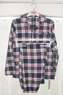
Costume & Props Research for Magazine Cover, Poster & Trailer
On the film poster I will only need to source 1 costume - which can be used throughout the production including the magazine cover and throughout the trailer. The costume is a traditional set of pyamas which will be work by the child who is dead. The reason for this costume is that it represent the past time, which is what i wanted to come across the the audience.
Unfortunately i wasn't able to get the costume which matches the image below and which is drawn on my flat plans on the magazine cover and film poster.

Here is a still shot which shows the face of the girl. I think the look that she could be easily be replicated.

Unfortunately i wasn't able to get the costume which matches the image below and which is drawn on my flat plans on the magazine cover and film poster.

In order for me to try and keep the more traditional style of pyjama i looked around different clothing stores and eventually found some which still have a traditional feel to them.

These particular pyjamas were at a low budget of only £9
Character Research -
On the TV an advert came on for a short time which shown a little girl which looked 'dead' and fitted what i wanted my character to look like, when i eventually found the advert again it was one for phones4u - the character and the costume of what the girl is wearing is very similar to what i want to portray in my products.
Here is a still shot which shows the face of the girl. I think the look that she could be easily be replicated.

Thursday, 29 September 2011
Thursday, 22 September 2011
Sound Ideas
After researching through a lot of trailers to gain inspiration for my soundtrack a lot of them featuring kids use nursery rhymes or a child singing. So far an idea for the name of my film is 'Ben', therefore i came up with the idea of one of the children singing the first verse of the Michael Jackson song Ben, as in the lyrics it talks about a 'friend' and the idea for my film is that the dead child would come across as an imaginary friend. Although some people may think that this is 'cheesy' i am going to try it out with one of the child actors singing it and see how it turns out
Following a conversation with a tutor on there facebook for students, i asked if the idea i had would be too cheesy. After a short discussion she said it would be ok if i used additional sounds - here is the conversation.


Following a conversation with a tutor on there facebook for students, i asked if the idea i had would be too cheesy. After a short discussion she said it would be ok if i used additional sounds - here is the conversation.
Here is the tutorial video i found. - After watching this i noted down the keys which were used.

My recording of the soundtrack -
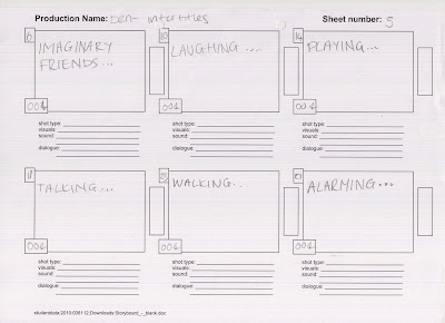
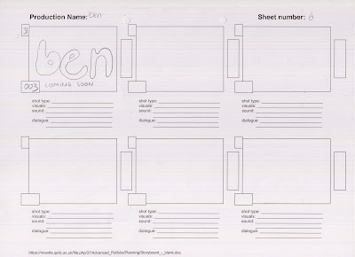
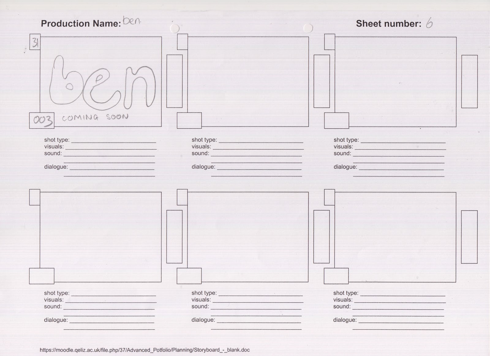
Storyboards
These are my storyboards for my film trailer, inter-titles and on a separate sheet but all shots are numbered.


Flat Plans
Film Poster -

I want the poster for my film to relatively simple, because i want to make all the attention focus on the boy featuring on it. The reason behind the fonts is that i wanted it to represent a child's handwriting, which is why i decided to do the 'e' the opposite way around. I also wanted the font of the tagline which says 'who is he talking to?' to represent the child's handwriting. I have stuck with the colour red which connotes horror to make the audience aware that the film is a horror.
Magazine Cover -
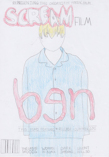

Magazine Cover -

Subscribe to:
Comments (Atom)