Flat Plans
Film Poster -
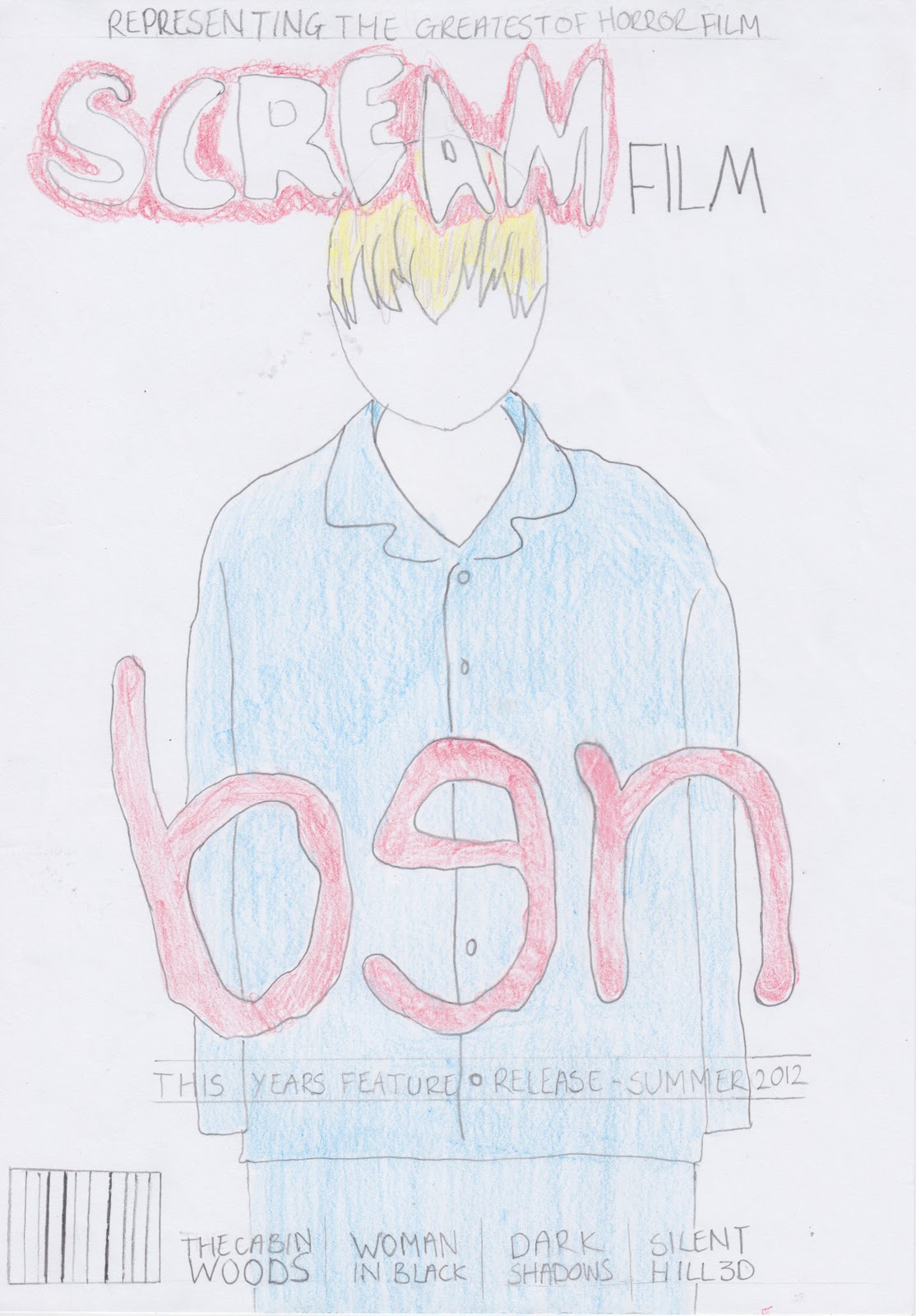
I want the poster for my film to relatively simple, because i want to make all the attention focus on the boy featuring on it. The reason behind the fonts is that i wanted it to represent a child's handwriting, which is why i decided to do the 'e' the opposite way around. I also wanted the font of the tagline which says 'who is he talking to?' to represent the child's handwriting. I have stuck with the colour red which connotes horror to make the audience aware that the film is a horror.
Magazine Cover -

No comments:
Post a Comment