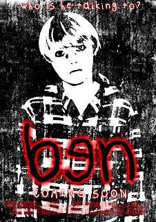
I started with using a plain white background in order to position the rest of the components onto it and make sure they were in an appropriate place.
I then added the masthead. I used a font called 'Darlin BTN' as it looked childish - which is what i wanted to portray in my products. Originally the 'e' of the masthead was the right way round, but after rasterizing the text i changed the direction in which it looked. I then added a red outer glow to carry on the typical conventions of a horror using the 3 colours of red, white and black.
I then added the tagline to the product, i chose to use the same font as the title because, again, it brings the childish component i was looking for, i also added an outer-glow on the tagline, but made sure it was less visible and only had a little glow to it.
I added 'coming soon' which is apparent on many different posters i have looked at, and again on this i added the outer glow the same as the masthead and tagline to carry on the continuity.
For the image above, i uploaded an image i had taken to a website called befunky.com, i reason i used the website instead of using photoshop was becuase i was unable to create this particular cartoon-ish effect on there, and the website eabled be to do it easily and wasnt time consuming.
Next i used the 'threshold' effect on photohsop, and made it like above. I played around with it until i was happy with the way it looked. Also i feel the final outcome of the image looks well and suits the genre i am representing.
Next i added a website for my film. I decided to use a simple web address 'www.benthemovie.co.uk', as these are what i seen upon researching other film posters. the font i used was called 'Times' which was downloaded from dafont.com, the reason i chose this font was because it had a traditional feel to it, which i wanted to come across in my products.
The final thing i did to my poster was added the BBFC, earlier in the research stages i thought 15 was a suitable age for horror as it was the same for both horror trailers/posters i had looked at. I downloaed the image from wikipedia commons.


No comments:
Post a Comment