Friday, 30 September 2011

Costume & Props Research for Magazine Cover, Poster & Trailer

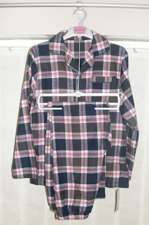
On the film poster I will only need to source 1 costume - which can be used throughout the production including the magazine cover and throughout the trailer. The costume is a traditional set of pyamas which will be work by the child who is dead. The reason for this costume is that it represent the past time, which is what i wanted to come across the the audience.
Unfortunately i wasn't able to get the costume which matches the image below and which is drawn on my flat plans on the magazine cover and film poster.


In order for me to try and keep the more traditional style of pyjama i looked around different clothing stores and eventually found some which still have a traditional feel to them.


These particular pyjamas were at a low budget of only £9


Character Research -
On the TV an advert came on for a short time which shown a little girl which looked 'dead' and fitted what i wanted my character to look like, when i eventually found the advert again it was one for phones4u - the character and the costume of what the girl is wearing is very similar to what i want to portray in my products.


Here is a still shot which shows the face of the girl. I think the look that she could be easily be replicated.


Thursday, 22 September 2011

Sound Ideas

After researching through a lot of trailers to gain inspiration for my soundtrack a lot of them featuring kids use nursery rhymes or a child singing. So far an idea for the name of my film is 'Ben', therefore i came up with the idea of one of the children singing the first verse of the Michael Jackson song Ben, as in the lyrics it talks about a 'friend' and the idea for my film is that the dead child would come across as an imaginary friend. Although some people may think that this is 'cheesy' i am going to try it out with one of the child actors singing it and see how it turns out


Following a conversation with a tutor on there facebook for students, i asked if the idea i had would be too cheesy. After a short discussion she said it would be ok if i used additional sounds - here is the conversation.


Here is the tutorial video i found. - After watching this i noted down the keys which were used.


My recording of the soundtrack - 

Storyboards

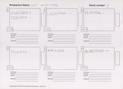
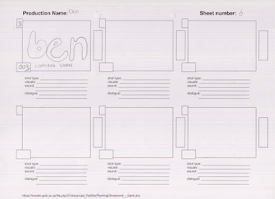
These are my storyboards for my film trailer, inter-titles and on a separate sheet but all shots are numbered.


Flat Plans

Film Poster - 


I want the poster for my film to relatively simple, because i want to make all the attention focus on the boy featuring on it. The reason behind the fonts is that i wanted it to represent a child's handwriting, which is why i decided to do the 'e' the opposite way around. I also wanted the font of the tagline which says 'who is he talking to?' to represent the child's handwriting. I have stuck with the colour red which connotes horror to make the audience aware that the film is a horror.


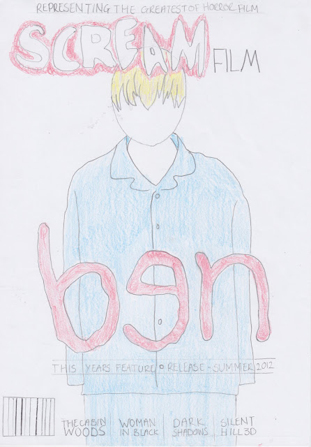
Magazine Cover - 


Wednesday, 14 September 2011

Pitch & Pitch Feedback

*Pitch Video*

Pitch Feedback - 


*Vlog - Reflection of Feedback*

Friday, 9 September 2011

Proposal of Ideas

The ideas i have had for my products so far is that it will feature a boy who died in the 1940-50s, this boy will haunt another child who will see it as being his 'friend' and the single mother thinks that he is imaginary until things start to happen. The boy who died drowned and will always appear wet and leave puddles where he is talking the younger child - this is when the mother start to suspect that he is actually real. The difference in clothing will contrast with the olden style and the modern which is often seen in horror films featuring children.

For the trailer i will have a different shots of the kids playing and will have a slow haunting editing pace with a soundtrack playing in the background, also i may include intertitles as this is frequent in many different films and i feel it works effectively.

Summary

Primary Audience Research


Rachel Walls, 18
After showing her the trailer, magazine cover and film poster;

  • Recognised that it was the horror genre
  • exorcist and insidious are what she associated with horror
  • Dark and gloomy colours
  •  

Thursday, 8 September 2011

Audience Conclusion


Audience Research

The genre of my trailer is a horror, and would suit a mainstream audience because horror is a popular genre. Successful films like The Omen and The Children (The Day) make me confident in what i'm trying to achieve with my products.
The Omen - 

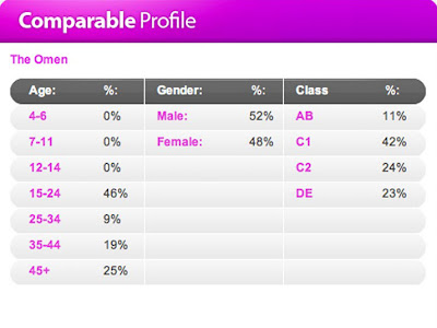
The Omen has a certificate of 15, this suggests that it could include violent/scary scenes which would be unsuitable for younger ages. The poster in this particular profile used red and black to connote the horror genre which is very often seen in horror films, also because the film has a certificate of 15 it tells me that the film has been targeted at people 15 years of age and above. 


On the statistics above you can see that the main target audience for this film are 15-24 year olds with 61%, this tells me that these are the people i need to question conducting my primary research. Also people in the ages of 45 and above have 20%, this also tells me that i may need to pay some attention to there ideas and what they feel about the products. The main age group of this film are females with 63%, this tells me that i need to question more females than males when doing the secondary research as these are the people i need to reach out to with my work. Because of the finding above i need to focus my research on people between the ages of 15-24 and 45+.


The Children (The Day) -


 The Children (The Day) has a certificate of 18 which isn't shown above. This tells me that this film, compared to The Omen, may be a lot more 'gory' and have more violent scene unsuitable for the younger ages. Although this profile doesn't show the film poster, after researching it, i can see that the blood sprinkles of blood on the image suggests the gore theory i mentioned. Because the film is rated an 18, it tells me that possible viewers are those surrounding that age.

From the statistics above you can see that the main audience is, again, 15-24 year olds, from this i can see that these are the main target audience for horror films as it is apparent in both profiles. Again the same as The Omen people ages 45 and above are also those i need to target and get opinions from. On this profile you can see that the gender is really split in half, with males 52% and females 48%, i can now tell that i need to focus on both male and females when conducting primary research.

___________________________________________
Empire Magazine - 


From the above magazine covers of Empire, you can see that they all stick to the same colour scheme and how they work with the actual feature, for example the hannibal cover used traditional fonts which connotes the film, the hellboy cover also fits in the the film being featured as it has more graphics applied to it i.e the masthead on fire, and the joker cover used more comedic fonts, which again represents the film. These covers have been constructed carefully in order to appeal the target market. Also the overall audience for Empire  is 76% Male, this shows in the magazine covers as they all have a sense of 'masculinity' on them wether it be fire, or the style of fonts.

Rue Morgue - 


The above magazine covers show Rue Morgue, which is an independent horror magazine. Immediately you can see the difference between the mainstream and this one. Rue Morgue tends to use more graphics on it and kind sort of a cartoon. Unlike Empire this magazine uses different colours, the titles on all issues of this magazine are exactly the same, except the colour, this suggest continuity and sense of professionalism even though its a independent magazine and is target at a more niche audience.

Sunday, 4 September 2011

Character Research - 3/9/11

So far the characters i have thought about featuring in my film are;


A ten year old boy who died from drowning in the 1940-50s era.
A young boy who can see the dead boy in present time.
A single mother who worries about the young son and who he can see.


The dead boy will be wearing 1940-50s clothing or plain traditional pyjamas - also another idea for the boy is that he will always be dripping wet still from drowning. Ideally i would like the boy to be pale, which to do so i would have to get waterproof face paints so it doesn't run.


The younger boy will be wearing more modern 20th century clothing so it contrasts with the dead boy. Unlike the dead boys character there will be no alterations needed to the boys face (make-up etc).


The mother will be a single mum who is worrying about her son - she will be wearing simple clothing i.e. jeans and a t-shirt.


Also because i am using children as the main feature in my products i will need to get parental permission which states that i'm aloud the film them and show the finished work publicly.

Idea Development

Below is a collection of images - this consists of what i feel i need to consider when creating my products;