This is the original image i started out with, after making the background black and feathering it i got the effect i wanted before i actually started editing the photo to how i wanted it. To start out with i had a big shadow behind it and struggled to get rid of it, but using the 'outer glow' and 'inner glow' i could make it seem feathered and make the outline a little softer.
In order to get the look i wanted, i made used many different tools, one of which was a layer mask which i used to merge 2 images together, what i mean by this is i duplicated the main image and used the threshold effect on one of them, then changed the layer style which merged them together. Then using the 'burn' tool i added the extra dark areas around the eyes, in the mouth etc to create a creepy look.

Next came the masthead, i decided to call the film 'cine de terror' as it had the niche feeling i wanted to have my magazine represent, originally i was going to call it 'scream film' but felt that the name its self was too mainstream and i wanted my product to have an original feeling to it. 'cine de terror' is horror film in Spanish, and i think that by having the masthead in another language is a good way of enticing readers in to find out what the actual magazine is about. - on the masthead i used a plain black font as i wanted a glow around it, unsure of what colour to use i was stuck between choosing red or white, as you can see i went for the white as it stand out more, and if i went with the red it wouldn't have stood out as much because the vast majority of the magazine cover has some kind of red in it. The font its self is a stereotypical 'scary' font, which i thought would look great as a masthead on my magazine cover.

The next thing i added was the bar code, edition, website link and prices. Because the bar code isn't necessarily one of the more striking and eye catching parts of a magazine cover i used the same colour scheme i was going to use on the rest of the cover, red white and black. Underneath the bar code and website link i added universal prices so the magazine could be available worldwide, also i felt that it was a must to add the euro (€) because the name of the magazine cover is Spanish.
I added the 'PLUS' feature, which i seen on many other professional magazine covers so i felt it was appropriate to have it on mine. I stuck to the colour scheme of white and red connoting the genre, instead of having it all one colour, i put 'EXCLUSIVE' in red to break it up from the rest which then draws the readers eye to that bit because of the contrast between colours.
The sell lines were added next, as you can see its not the normal layout for sell lines as they are normally bigger and stand out more, but because i wanted a niche product i challenged the conventions, and gaining some inspiration from Rue Morgue that i researched i made the text a little smaller rather than large so it wouldn't take away the focus of the other aspects of the cover, letting the reader see each individual feature of the magazine. I decided to use the fonts i have becuase it looked traditional and kind of had an olden times feel to it.
The next thing i added was the skyline, with it i kept the theme of horror by using the scary like font, which is obviously a connotation of horror. Also by using the red it kept with the continuous colour theme that i have kept to on the magazine. Initially i wasn't going to add one but after doing flat plans and seen what it would look like without i felt like the magazine had something missing from it.
The thing i added next were the upside down crosses, i got my inspiration for this off the omen version of rue morgue, i felt that it looked appropriate for the magazine as the upside down cross is commonly known as the cross of St. Peter, which is also a symbol of satanism and regularly associated with horror. Again, i stuck with the rule of 3 colours using red and black, i feel that the cross of st peters between the new films break them up so the reader is drawn to each individual sell line.

The 'feature release' was added next, after putting the sell lines etc on i though it would be good to have soemthing explaining what they are, obviously becuase its a film magazine they're going to be films, but i thought it was necessary to put the 'this years feature release' onto it as it explains it to the readers. I stuck with the colour scheme again using white and red, if you see the larger version of you can see that i have incorporated the St Peters cross onto it on the ends of the lines i have put the writing in between, i thought this just made it have a more traditional look and suggests continuity throughout the cover.
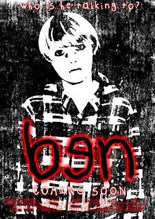
The film title was added next, i am aware that in some films they have different versions of mastheads, but i decided to keep it the same as the poster so there is continuity between the 2 products. I made it big, so it is one of the main features of the cover so the reader knows that the main story is about 'ben'


